
Supervisor Statistics
In the "Statistics" section, the supervisor has access to an overview of the performance of the corporate population.
The following section is further divided into different tabs:
Overview
Report Awareness
Report Channel
Report Phishing
Report Remediation
Overview
This section contains the following widgets:
Global Participation
User Distribution by Services
Ranking
Global Participation
The “Global Participation” chart shows, as a percentage, the trend over time of the overall participation of the corporate population, divided into three sections: Awareness, Channel, and Phishing.
For Awareness and Channel, the chart shows the percentage of completed forms by all users compared to those released, calculated at that moment. For example, in the first month, the calculation is based on one form, in the second on two, and so on, month after month.
For Phishing, the chart represents the percentage of emails opened compared to those sent, also calculated month by month, capturing the situation of each individual period.
The global participation chart is updated every 8 hours.

Filter Data
The data in the Overview can be filtered: by selecting the desired filters (choosing the values of the organizations of interest), the filter applies to all widgets present in the section and also in the downloadable reports.
Generate "OVERVIEW" Report
The supervisor can download the data and generate a report in various formats (PPT, CSV, or XLSX) by clicking the “Generate Report” button and selecting the desired report type.
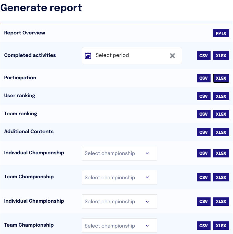
The “Report Overview” provides an overview of user engagement, including:
Overview of the three services (Awareness, Channel, Phishing)
User Status on Training (Awareness and Channel)
Behavior regarding phishing (and breakdown into various risk categories)
Comparison between alignment to the training path and phishing behavior
Participation in various services compared over time
Top 10 users ranking
The “Completed Activities Report” allows the supervisor to view, for each user and for each activity (Awareness modules and Channel episodes), information such as time spent, points earned, availability date, start date, and completion date. The data can also be downloaded for a specific time period.
The “Participation Report” allows the supervisor to view each user's alignment status to the training course (in line, regular, irregular, inactive) and the contents of both released and completed services. For users, the phishing status is also highlighted if the service is active.
The “User Ranking Report” allows the supervisor to view in detail all users, their team affiliation, their ranking position, points accumulated up to that moment, and medals earned.
The “Team Ranking Report” analyzes the position of each team in the ranking, the points, and the medals associated with each team.
The “Additional Content Report” provides the same information as the “completed activities” report but exclusively on additional content (cyber pills).
The “Individual Championship Report” can be downloaded for a specific championship. The report contains the following information: the position of each participant in the selected championship, the points they have accumulated (phishing points are not included), and the badges obtained.
The “Team Championship Report” is downloadable for a specific championship. It allows viewing the ranking position of teams in the specific championship and their respective scores.
Doughnut Chart - User Distribution by Services
Within this chart, it is possible to visualize the distribution of users in the various participation tiers for training programs.
On the left, you can see
the total number of users registered on the platform
the total number of teams (if present)
On the right, the numbers of users in the various tiers are observed, and for each tier, the status of the users regarding phishing simulations is indicated.
In line: Users who have completed all activities or are behind by a maximum of 2 activities compared to those released.
Regular: Users behind by 3-5 activities compared to those released.
Irregular: Users behind by more than 5 activities compared to those released.
Inactive: Users who have not completed any activities or are completely inactive (they have NOT accepted T&C)
The chart integrates both the Awareness/Channel statuses (inner ring) and behaviors related to phishing (outer ring), offering a more complete view. This approach allows correlating information between the different available services, providing richer and more detailed data to better understand the interaction between awareness and phishing risk.
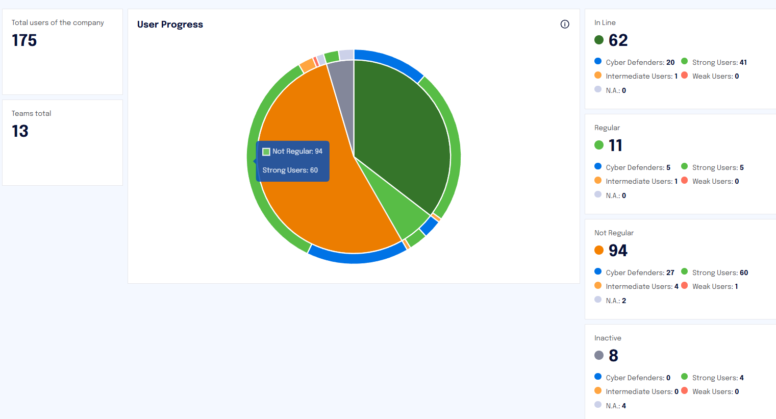
This chart is updated daily.
Ranking
This section contains a chart that shows the ranking of all users and the respective points acquired.
The ranking can be viewed in relation to:
Company users
Users within a team (in case of team gamification)
Company teams
Championship
NOTE If the “Cyber Guru Phishing” service is active, the ranking indicates, for each user, not only the alignment status to the path but also the risk level related to phishing simulations.
This chart is updated daily.
Report Awareness
In the “Report Awareness” tab, the supervisor will have all the data related to user participation in the Awareness training course.
This section contains the following widgets:
User Numbers
User Distribution based on Participation Status
Time Spent on Activity in Minutes
Points Earned per Activity
The data can be filtered: the chosen filter applies to all widgets present in the section and to the reports.
All charts are updated daily.
User Information
In the first widget at the top left, the following information is available:
Total users of the company
Total teams
In the central doughnut chart, the supervisor will graphically see the distribution of users based on their level of participation in the Awareness modules.
In line: Users who have completed all activities or are behind by a maximum of 2 activities compared to those released.
Regular: Users behind by 3-5 activities compared to those released.
Irregular: Users behind by more than 5 activities compared to those released.
Inactive: Users who have not completed any activities or are completely inactive (they have NOT accepted T&C policies)
The same information is presented numerically on the right side of the widget.
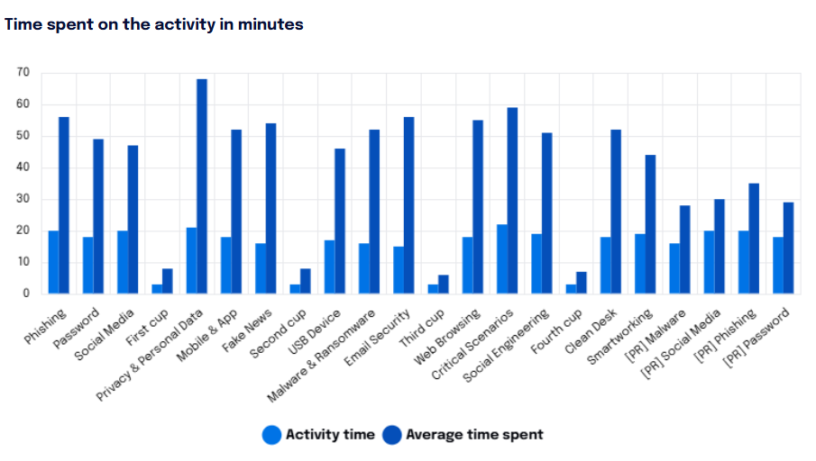
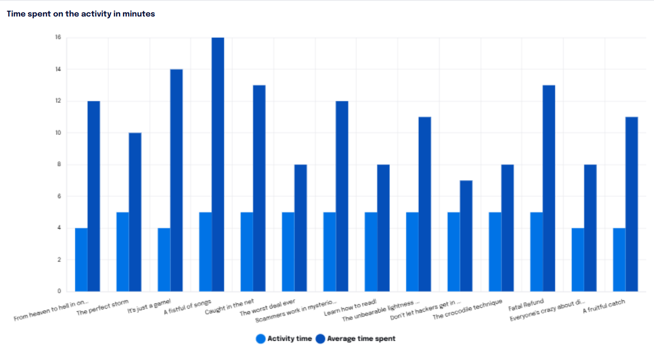
Time Spent on Activity in Minutes
The supervisor can view the time spent by users on each module in minutes: thus, they will see the minutes taken by users to complete each module.
The first bar in the chart represents the actual duration of the activity (for example, 16 minutes for module 1 “Phishing”), while the adjacent bar represents the average time, in minutes, spent by users on that module.
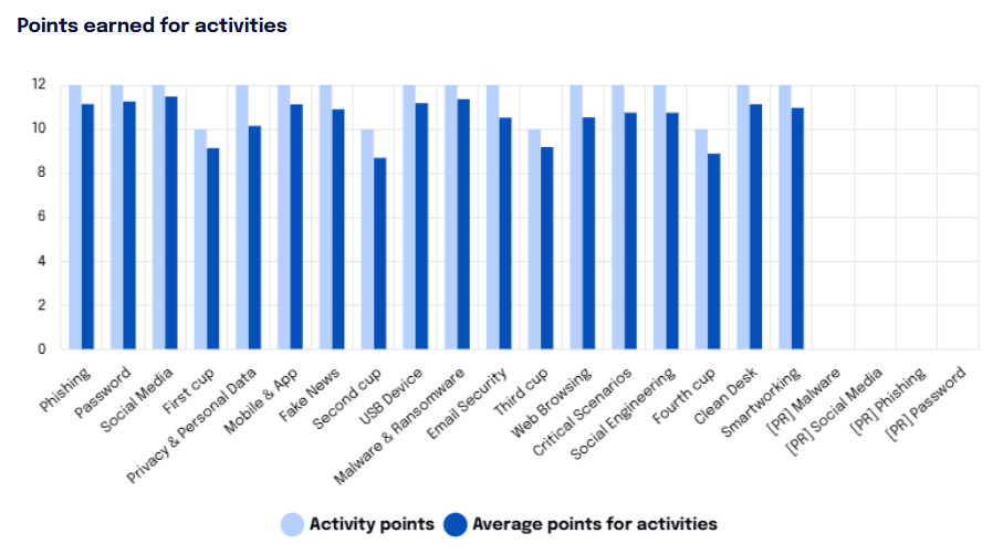
Points Earned per Activity
The “Points Earned per Activity” chart, in the lower right part, shows the points associated with each individual activity (module) and the average points earned by users for each module.
Generate AWARENESS Report
In this section, it is possible to download various reports related to the Awareness service.
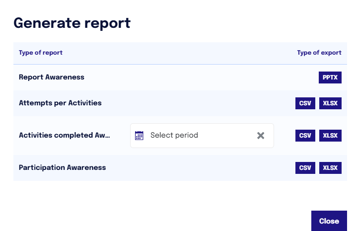
The PPT “Report Awareness” illustrates the distribution of users in the Awareness service based on their progress, showing the total time (in minutes) dedicated to each activity (training module) and the points accumulated for each module.
The report “Attempts per Activity” contains detailed information on users' progress within the training activities. Each row of the file includes the User's First Name and Last Name, the Activity performed, the Module, the Questions asked, the Correct Answer, and the User's Response. Additionally, the Result of each attempt and the Time Spent to complete the activity are reported. This data allows for analyzing user performance and engagement in various training activities.
The report “Completed Activities Awareness” shows, for each Awareness module, the time spent by the user on it, the points earned, the availability date, the start date, and the completion date. The report can be downloaded for a specific time period.
The report “Participation Awareness” shows for each participant the modules viewed and the user's alignment status to the training path, as well as the status regarding phishing.
Report Channel
In the “Report Channel” tab, the supervisor has the same metrics as the previously analyzed section, but referring to Channel episodes.
This section contains the following widgets:
User Numbers
User Distribution based on Participation Status
Time Spent on Activity in Minutes
All charts are updated daily.
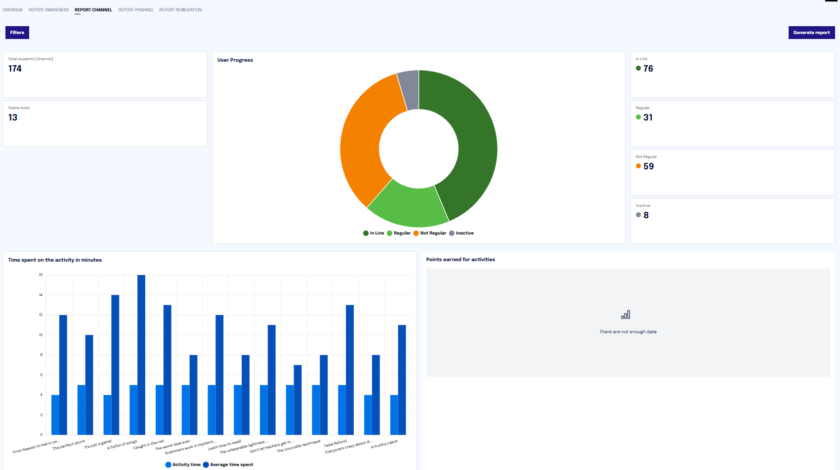
User Information
In the first widget at the top left, the following information is available:
Total users of the company
Total teams
In the central doughnut chart, the supervisor will graphically see the distribution of team users based on their level of participation in the Awareness modules.
In line: Users who have completed all activities or are behind by a maximum of 2 activities compared to those released.
Regular: Users behind by 3-5 activities compared to those released.
Irregular: Users behind by more than 5 activities compared to those released.
Inactive: Users who have not completed any activities or are completely inactive (they have NOT accepted T&C policies).
The same information is presented numerically on the right side of the widget.
Time Spent on Activity in Minutes
The supervisor can view the time spent by users on each episode in minutes: thus, they will see the minutes taken by users to complete each episode.
The first bar in the chart represents the actual duration of the activity (for example, 10 minutes for the first episode “From Heaven to Hell in One Click”), while the adjacent bar represents the average time, in minutes, spent by users on that episode.
Generate Report
Within this section, it is possible to generate various reports related to the Channel service.

The PPT “Report Channel” illustrates the distribution of users in the Channel service based on their progress, showing the total time (in minutes) dedicated to each activity (training episode).
The report “Completed Activities Channel” shows, for each Channel episode, the time spent by the user on it, the availability date, the start date, and the completion date. The report can be downloaded for a specific time period.
The report “Participation Channel” shows for each participant which episodes they have viewed, highlighting the user's status regarding the training program and phishing.
Report Phishing
In the “Report Phishing” section, data related to simulated phishing attacks is available.
The data can be filtered by clicking on "Filters": it is possible to choose the campaign or the "Organizations". The filter applies to all widgets and downloadable reports.
All data on this page is updated every day every two hours, between 10:00 AM and 10:00 PM.
If no filter is selected, the displayed data refers to the last campaign.

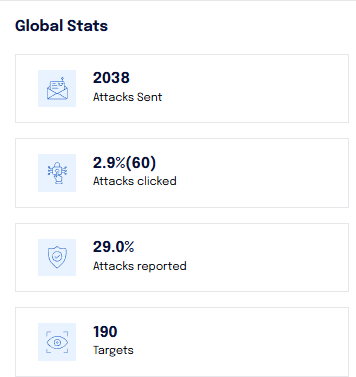
Information on Attacks
You can view information related to the attacks sent in the last campaign and the click rate for the last campaign.
In the global statistics on the right, the data is cumulative and refers to all campaigns that have occurred (including any ongoing campaign).
Risk Evolution
The “Risk Evolution” bar chart allows for analyzing the evolution of risk, examining the distribution of users based on their behavior for each phishing campaign that has occurred.
It is important to note that the evolution of risk only concerns users who have interacted (clicked/reported) at least once with the attack emails that are sent.
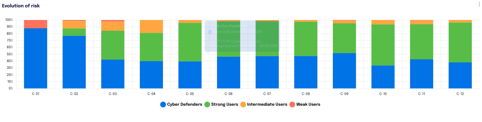
Users are divided into:
Cyber Defenders: users who recognize attacks and report them by activating the appropriate function provided.
Strong Users: users who have clicked at least once in the past, but since then click less than once every 5 campaigns.
Intermediate Users: users who click at least 2 times in 5 campaigns.
Weak Users: users who click very frequently - approximately 3 times in 5 campaigns.
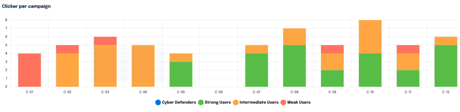
Clickers per Campaign
The same chart also allows for analyzing the number of clicks for each campaign.
To view this type of chart, simply click on the three dots in the upper right corner. This chart serves as an absolute value detection.
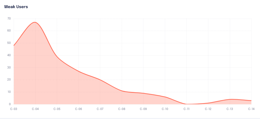
Weak Users
This widget illustrates how the behavior of “weak users,” or those who click repetitively, develops across different campaigns.
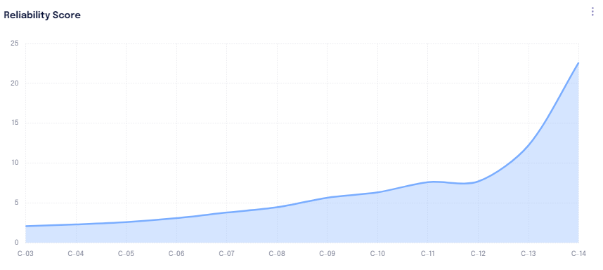
Reliability Score
The chart titled “Reliability Score” expresses the resistance to attacks by the target, namely the corporate population. This indicator conceptually represents the number of attacks needed to “hit” the target audience.
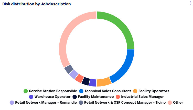
Risk Distribution
The “Risk Distribution” chart is based on the grouping criteria chosen by the company. This distribution is affected by the population of the groupings. Typically, a very populous grouping expresses a greater risk compared to a small grouping, even in the face of a lower Click-Rate.
The chart allows for analyzing data for all Organizations.
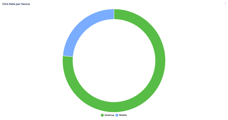
Click Rate per Device
The “Click Rate per Device” chart allows for analyzing the click rate divided by device, or by clicking on the three points, the data can be analyzed by operating system or browser.
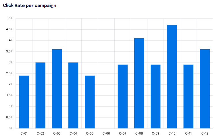
Click Rate per Campaign
The “Click Rate per Campaign” chart analyzes the click rate of users, distributed across all campaigns that have occurred.
The Click Rate is the percentage of users who fell victim to the attack compared to the number of attacks sent in that specific campaign.
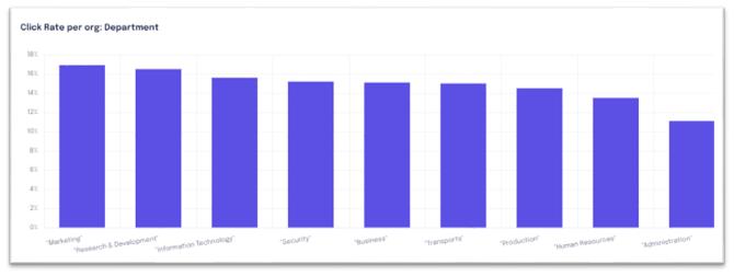
Click Rate per Org
The “Click Rate per Org” expresses the percentage of clicks compared to the number of attacks sent for each campaign, based on the grouping criteria chosen by the organization (e.g., Sector, Department, Business Function...). By clicking on the three dots in the upper right corner, it is possible to view the data also according to the parameters chosen for Org_2 and Org_3 (for example: role or business function).
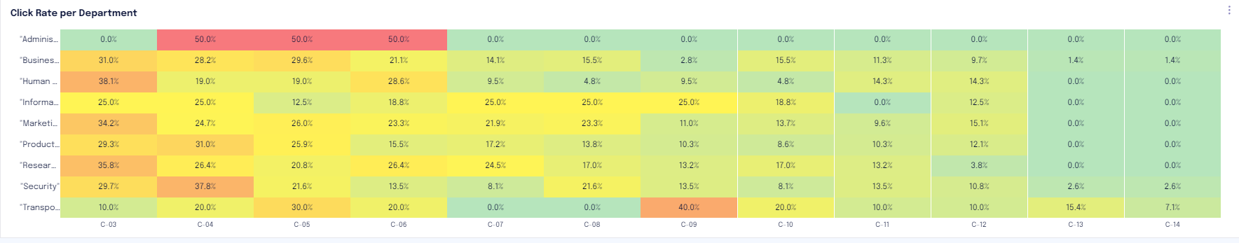
Click Rate per Organization
The “Click Rate per Org” table analyzes the click rate for each Org in each campaign, providing the percentage and highlighting in red the campaigns that were more critical.
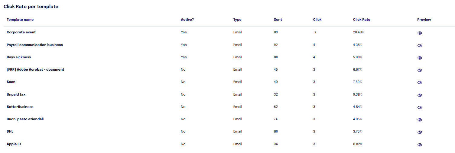
Click Rate per Template
The “Click Rate per Template” analyzes all templates, both active (used in the current campaign) and inactive (used in previous campaigns). The report also includes absolute values, the number of times that template has been used, and the total clicks received.
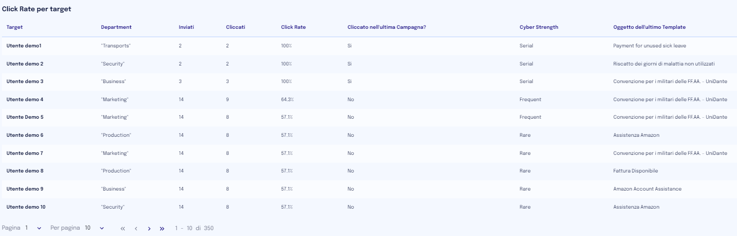
Click Rate per Target
The “Click Rate per Target” shows the click rate of each user. The report highlights the team affiliation, the absolute values of attacks sent and clicks made, whether the user clicked in the last campaign, and their risk group. Based on the choices made by the client organization, this report may be shown in anonymized form or with clear names.
Generate Phishing Report
Within this section, it is possible to export data from all campaigns or specific campaigns. A report can be generated in PPT format or export global data in CSV format.
The CSV file analyzes the behavior of each user for each template of each campaign.
Report Remediation
In the “Report Remediation” tab, data related to remediation campaigns, aimed at certain users to increase their resistance to cyber attacks, is visible.
Remediation data is only visible at the end of the process.
By clicking on "Details" of a specific remediation, you can see the affected targets, the template(s) used.
By clicking on "Report," it is possible to generate a PPT with the results of the remediation, while clicking on "export" allows generating a zip file with all the details of user interactions with the remediation templates.