Team Leader Statistics
In the “Statistics” section, the team leader has access to an overview of the team's performance.
Within this section, depending on the programs active on the company, are visible:
Overview
Report Awareness
Report Channel
Overview
Within the Overview are the following widgets:
Global Participation
Ranking
Global Participation
The “Global Participation” graph shows, in percentages, the trend over time in the overall participation of team members, broken down into the three sections: Awareness, Channel and Phishing.
For Awareness and Channel: the graph shows the percentage of modules completed by team members compared to those released, snapshot at the time.
For Phishing: the graph indicates the percentage of emails opened versus emails sent, photographed at the time.
The global participation graph is updated every 8 hours.
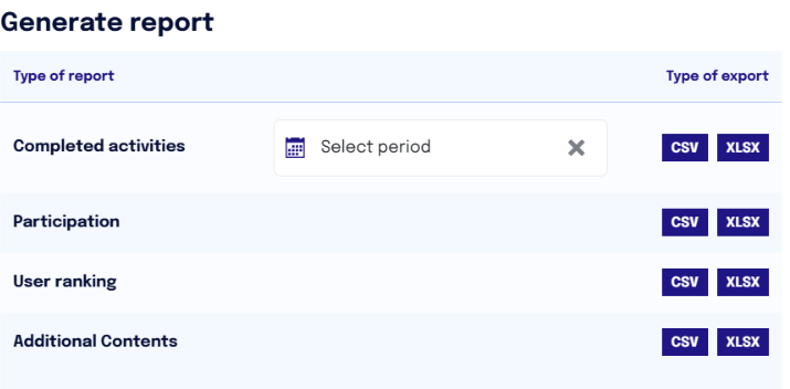
The team leader can download the data and generate a report in CSV or XLSX format by clicking on the “Generate Report” button and selecting the desired report type.
The “Completed Activities” report allows the team leader to view for each user in their team information such as module name, service type (Awareness or Channel), date of availability, first access, elapsed time, points, and completion date. The report can be downloaded with respect to a specific time period.
The “Participation” report allows the team leader(s) to view, for each team member and for each Awareness module and Channel episode, information such as participation status, Phishing status, cyber score, released and completed activities.
NB. In released activities, modules, episodes, and cups are included. Additional content is NOT calculated.
The “User Ranking” report allows you to view in detail all the users in the team, the ranking position with respect to the team itself, points accumulated so far, and medals won.
The “Additional Content” report shows for each user the additional content displayed, its date of availability, first access to the content, elapsed time, and completion date.
User Distribution
In the central part of the Overview, the team leader has visibility of
Total users in his/her team
Total total users in the company
Total number of teams
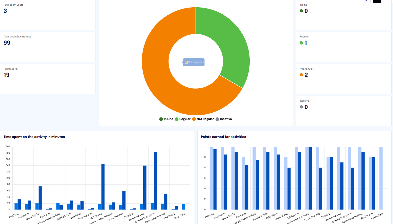
The central widget shows the distribution of team users with respect to their level of participation in training programs.
The graph integrates both Awareness/Channel states (inner ring) and phishing-related behaviors (outer ring), providing a more comprehensive view. This approach allows information to be correlated across the different services available, providing richer and more detailed data to better understand the interaction between awareness and phishing risk.
For more details on phishing states you can consult this article.
The same information can be found in the numerics on the right.
Updating of this chart occurs daily.
Ranking
This section also contains a chart showing the ranking of users within the team, and the ranking of the team in relation to the other teams involved in the platform.
Updating of this graph occurs daily.
Report Awareness
Under the “Report Awareness” tab, the team leader will have all the data on user participation in the Awareness training course.
This section updates daily.
Within this section are the following widgets:
Numerical users
Distribution of users by participation status
Time spent on activity in minutes
Points earned per activity
In the first widget at the top left, there is information regarding:
Total team users
Total company users
Total Teams
In the center donut chart, the team leader will graphically see the distribution of team users by degree of participation in the Awareness modules.
In Line: Users who have completed all activities or are a maximum of 2 activities behind those released.
Regular: Users who are 3-5 tasks behind those released.
Non-regular: Users who are more than 5 activities behind those released.
Inactive: Users who have performed no activities or are completely inactive.The same information is shown in numerical form on the right side of the widget.
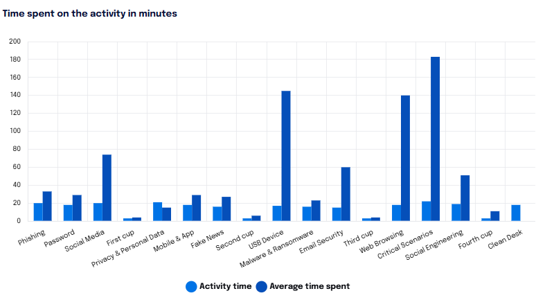
Time spent for the activity in minutes.
The team leader will be able to view the dwell time of the team users for each module in minutes: he/she will then see the minutes taken by the team to complete each module. The first bar in the graph represents the actual duration of the activity (e.g., 16 minutes for module 1 “Phishing”) the next bar, on the other hand, the average time, in minutes, spent by team members on that module.
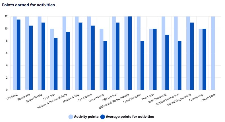
Points obtained per activity
The graph “Points gained by activity,” on the other hand, shows the points associated with the individual activity (module) in the first bar and those on average won by the team users for each module in the next bar.
Generate Report
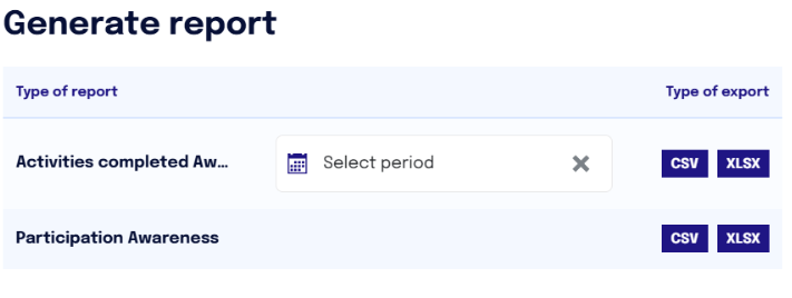
In this section, a report can be generated by downloading data on completed Awareness and Participation activities in CSV and XLSL formats.
The “Activities Completed” report allows the team leader to view for each user on his or her team and for each Awareness module information such as module name the date of availability, first access, elapsed time, points, and completion date. The report can be downloaded with respect to a specific time period.
The “Participation Awareness” report presents a detailed account showing for each participant on the team the modules viewed and, for each module, the percentage of participation of each indicating whether the user is regular or not.
Report Channel
Under the “Report Channel” tab, the team leader is provided with the same metrics as in the previously analyzed section, but related to Channel episodes.
Updating of this section occurs daily.
Within this section are the following widgets:
Numerical users
Distribution of users by participation status
Time spent for the activity in minutes.
In the first widget at the top left, there is information regarding:
Total team users
Total users of the company
Total Teams
In the center donut chart, the team leader will graphically see the distribution of team users by degree of participation in Channel episodes.
In Line: Users who have completed all activities or are a maximum of 2 activities behind those released.
Regular: Users who are 3-5 tasks behind those released.
Non-regular: Users who are more than 5 activities behind those released.
Inactive: Users who have performed no activities or are completely inactive.
The same information is shown in numerical form on the right side of the widget.
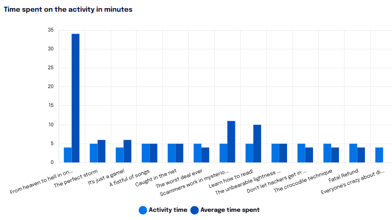
Time spent for the activity in minutes.
The team leader will be able to view the dwell time of the team users for each episode in minutes: he/she will then see the minutes taken by the team to complete each episode. The first bar in the graph represents the actual duration of the activity (e.g., 10 minutes for the first episode “From Heaven to Hell in a Click” ) the bar next to it, on the other hand, the average time, in minutes, spent by team members on that episode.
Generate Report
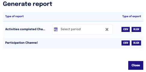
Within this section, it is also possible to generate a report by downloading data on Channel's completed activities and participation in CSV and XLSX format.
The “Channel Completed Activities” report, on the other hand, shows for each Channel episode the time the user has been on it, the date of availability, first access, and the date of completion. The report can be downloaded with respect to a specific time period.
The “Channel Participation” report shows for each team participant, which episodes he or she has viewed, and for each of these shows the percentage of participation of the members of that team, also highlighting the user's status, whether regular or not


